ArtNouveauVision Blog

Can We Use Plywood for Murals and Wall Art?
When people think about wall art, a plywood mural is not always the first idea—most imagine painted canvases, digital prints, or framed photographs. But lately, a quiet revolution has been happening in the world of home décor and interior design: plywood.What was once considered purely a construction material is now stepping into the limelight as a medium for creativity. Artists, architects, and even DIY enthusiasts are discovering how plywood can serve as the foundation for murals and large-scale wall décor. Affordable, versatile, and surprisingly stylish, plywood offers opportunities that traditional canvas and drywall simply can’t match.Let’s explore why plywood is becoming a favorite in modern interiors, and how you can use it to create stunning murals and art for your walls.A Brief History of Plywood Mural: From Utility to ArtPlywood dates back to ancient Egypt, where thin layers of wood were glued together for furniture. But in the modern age, it was mostly associated with construction—flooring, paneling, and cabinetry.Artists, however, have always pushed boundaries. In the mid-20th century, some muralists experimented with plywood as a portable surface for large artworks. These panels could be moved to galleries, displayed in outdoor festivals, or even mounted as temporary public art.Today, as sustainability and affordability play larger roles in design, plywood is enjoying a renaissance. It’s no longer “just plywood”—it’s a creative canvas.Why Plywood Works So Well for Wall Art So why are more and more people choosing plywood? Here are some of the biggest reasons: Affordability: High-quality canvas or hardwood can be expensive. Plywood is far cheaper but still durable. Durability: Plywood resists warping, making it ideal for large murals that need to last. Scalability: You can create murals spanning entire walls without worrying about the fragility of traditional canvases. Portability: A mural painted on plywood panels can be transported, reinstalled, or even sold in pieces. Texture & Warmth: Unlike drywall, plywood’s natural wood grain adds organic texture that enriches the artwork. Imagine a coworking office space: instead of a plain white wall, designers can install a plywood mural showcasing abstract art. The mural not only makes the environment inspiring but can also be updated or moved without damage. Different Styles You Can Achieve The beauty of plywood lies in its adaptability. Depending on your creative vision, plywood can fit into almost any design style: Minimalist and Clean: Sleek plywood panels painted in neutral tones or geometric designs echo the elegance of minimalist wall art. Perfect for modern apartments and offices. Rustic and Natural: Leave the wood grain exposed, or use pyrography (wood burning) to etch designs. Pair it with indoor plants, and your room feels instantly earthy and warm. Vintage-Inspired: Distressed plywood with antique finishes can recreate the nostalgic vibe of vintage wall art. Think rustic café interiors or farmhouse kitchens. Bold Contemporary: Oversized stencils, graffiti styles, or abstract splashes of paint on plywood can create dramatic, contemporary murals. Cultural or Traditional: In some cultures, plywood panels are painted with folk patterns or religious motifs, turning them into meaningful home décor. Real-Life Inspirations To see plywood in action, let’s look at some real examples: Community Festivals: Cities like London and Melbourne have used plywood boards as canvases during street art festivals. Artists create murals that are later displayed in galleries, proving plywood’s flexibility in public art. Cafés and Restaurants: In Tokyo, a coffee shop used plywood wall panels carved with cherry blossom designs. The result? A cozy, Instagram-worthy space that draws customers not just for coffee but also for aesthetics. DIY Homes: A family in Los Angeles created a plywood mural in their living room accent wall ideas featuring abstract mountain shapes. Each panel was painted in earthy tones, creating a striking focal point that felt both modern and organic. Corporate Offices: Tech startups are increasingly turning to plywood murals etched with motivational quotes or digital-inspired designs, blending branding with décor. Techniques for Plywood Wall Art Plywood isn’t just for painting—it invites creativity across multiple techniques:、 Painting: Acrylics and spray paints work wonderfully on plywood, especially when primed with gesso, making it a versatile surface for experimenting with creative acrylic painting ideas. Wood Burning (Pyrography): Create intricate etched designs, from floral patterns to detailed landscapes. Laser Cutting: With technology, plywood can be precision-cut into layered 3D designs. Mixed Media: Combine plywood with resin, fabric, or even LED lights for interactive murals. Collage & Decoupage: Use printed paper or textiles on plywood for a textured, mixed-media wall art effect. Imagine a plywood mural that incorporates carved patterns, painted details, and resin accents—suddenly, a simple material transforms into an art installation.Interior Design Applications Plywood murals aren’t just for galleries—they’re transforming everyday spaces: Living Rooms: Large plywood murals can replace traditional wallpaper as a bold design statement. Bedrooms: Plywood headboards painted with abstract or floral designs double as functional and decorative wall art. Kitchens: Small plywood art panels bring warmth to otherwise sterile spaces and can easily complement creative kitchen wall decor ideas. Offices: Companies use plywood murals to create an inspiring work environment. Commercial Spaces: Retail stores often incorporate plywood art to highlight brand personality. For example, a boutique clothing store could use plywood cutouts painted in vintage patterns, tying the décor directly to its product style.How to DIY Your Own Plywood Wall Art Creating your own plywood mural may sound intimidating, but it’s surprisingly accessible. Here’s a step-by-step guide:1. Choose the Right Plywood: Opt for cabinet-grade plywood for smoothness and durability.2. Prepare the Surface: Sand the wood, then apply primer or gesso for a paint-ready surface.3. Design Your Mural: Sketch your idea, or use stencils for geometric designs.4. Apply the Technique: Paint, burn, carve, or collage your design.5. Finish It: Seal with varnish or polyurethane to protect the artwork.6. Install Carefully: Mount panels with hidden brackets for a clean look.Pro tip: Break large murals into modular panels—this makes them easier to move and gives you flexibility to rearrange them in different spaces.Combining Plywood with Lighting Lighting can dramatically change how a plywood mural feels. For instance: Spotlighting: Highlights textured carvings or wood-burned details. Backlighting: Works beautifully with laser-cut plywood designs, creating dramatic shadows. Warm Lights: Enhance the natural tones of plywood, making the mural feel cozy. A restaurant in Barcelona used backlit plywood panels carved with Mediterranean patterns, creating a glowing mural that transformed the entire dining experience.Sustainability and Eco-Friendly Design One of the most compelling reasons to use plywood is its eco-conscious potential. Many types of plywood are sourced from fast-growing, renewable trees like birch or pine. Compared to large hardwood canvases, plywood has a lower environmental footprint.In a world where sustainable design matters, plywood murals allow artists and homeowners to make responsible choices without compromising creativity.Why Plywood is the Future of Creative Wall Design Plywood isn’t just a budget-friendly alternative—it’s an artistic medium in its own right. It bridges the gap between practicality and creativity, offering endless possibilities for expression.From bold contemporary murals to rustic wooden textures and even delicate minimalist designs, plywood adapts to every vision. If you love natural materials, want customizable designs, and care about sustainability, plywood murals are the perfect choice.So yes, we can—and should—use plywood for murals and wall art. The only limit is imagination.
Learn more
What to Do with an Empty Wall in Living Room
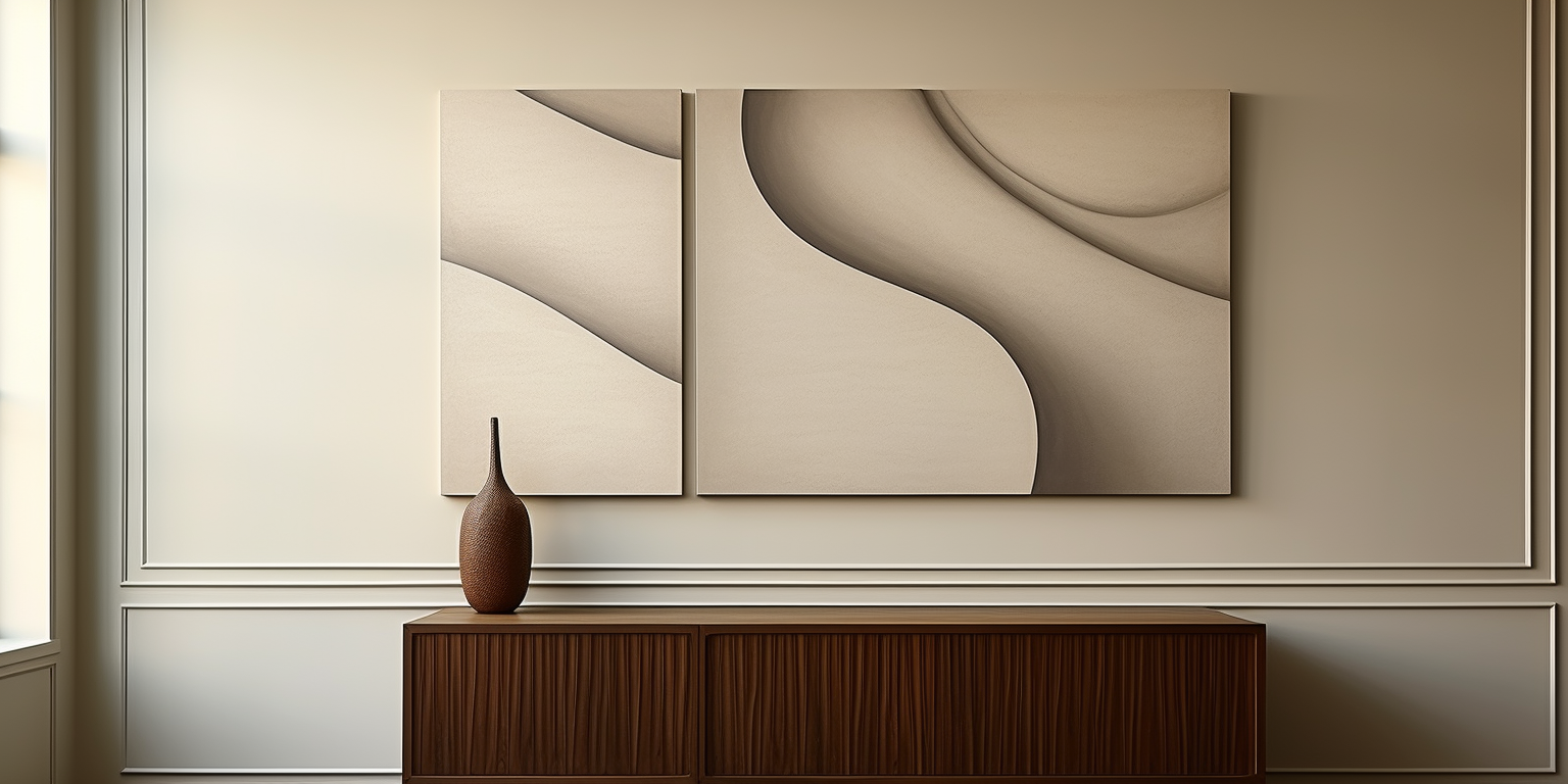
Some living rooms are spacious or lack a traditional TV feature wall, which can leave a large blank wall looking plain and uninspired. So, what to do with an empty wall in the living room to enhance the beauty?In fact, these blank walls can greatly improve the overall aesthetics and serve practical functions with proper design. In this post, we will introduce 10 ways to decorate and make use of empty walls in your living room as well as styling tips tailored to different home layouts and interior styles so that to help you refresh your space with ease.Key Factors You Should Consider Before Decorating an Empty WallBefore picking décor or furniture for the empty wall for your living room, it’s important to evaluate the wall’s potential and your practical needs, this will help ensure the final design in both aesthetics and functions in daily life. Here are four essential factors you should consider1. Wall Orientation and Natural LightingA south-facing wall receiving ample sunlight is good for plant shelves, artwork, or light-responsive décor.While, north-facing or dimly lit walls increase light by adding mirrors,light-colored decorations to walls. Making the most of natural light is the first method for a brighter space.2. Should Functionality and Aesthetics Be Balanced?Do you want a wall that simply “looks good,” or are you hoping it will be practical for storage, display, or reading? Clarifying this intention will help you balance between functionality and artistry, ensuring the design goes beyond surface-level decoration.3. Spatial Dimensions and Wall StructureThe length, height, and surrounding furniture layout of the blank wall will directly determine which types of decorations are suitable.4. Harmony with Overall Interior StyleAn empty wall needs to work well with the overall design style of your living room. It creates a sense of order and peace. When elements like color, shape, and texture blend well, the space feels complete.Before choosing any décor items, it's recommended to take a photo of the wall. Then you can use it to simulate the combinations of different materials, colors, and layouts. This helps you make smarter decisions caused by renovating on a whim. 7 Creative Ways to Use an Empty Living Room Wall An empty wall holds endless possibilities, it can be used as a canvas for artistic expression or a practical solution for storage. The following 10 ideas blend visual and functional design to solve the question on “what to do with an blank wall in the living room” and are suitable for nearly any living room setup.1. Install Floating Shelves or Wall RacksFloating shelves are one of the simplest and most effective ways to make use of an empty wall.Floating shelves not only help you organize and style your home, but they also can help accentuate your personal belongings in a way that no other piece of furniture can.2. Create a Wall Art GalleryA wall art gallery is a great way of displaying your beloved art in a dynamic and interesting way. It adds a focal point in the room and can be designed to fit into any space of your home. From outlining a reading nook or hanging in your dining room to decorating your entrance.3. Create a Family Display WallCreating a family display is another excellent way to decorate an empty wall and memorialize special family moments. You can use cork boards, chalkboard paint, metal grids, or magnetic walls to define your style while highlighting your most memorable lived experiences or to tell the story of your family history.4. Install Built-In Storage CabinetsDesigning built-in storage cabinets into load-bearing walls or corners of the living room transforms an empty wall into a functional storage solution. This approach can eliminate blank space and help keep clutter out of sight. Customizing with wooden or lacquered cabinet doors ensures a cohesive look with your overall interior style.5. Install Large Decorative MirrorLarge modern mirrors for walls have always been a rage when it comes to creating stylish, chic home decor. You can use long rectangular, curved, or irregular geometric-shaped mirrors to make it look more stylish.6. Mount a Wall-Mounted TV or ProjectorYou can also consider mounting a TV or laser projector on the wall. This will help you save more valuable space and create a more high-tech living room. 7. Use Wall Clocks or Statement Decorative Pieces A well-designed large wall clock, metal relief artwork, wooden accents, or handcrafted ceramic pieces can add artistic impact to an empty living room wall.Buying Tips: Recommended Décor and Storage ItemsChoosing the right home accessories is key to achieving your ideal wall setup. Below are some frequently used and highly practical wall products to help streamline your decorating process and avoid unnecessary detours.1. Shelves It is recommended to choose solid wood or metal shelves with strong load-bearing capacity and easy installation. This is Ideal for displaying books or greenery.2. Wall ArtChoose abstract paintings, illustrations, or photography that match your interior style. Pay attention to size and proportion to ensure harmony with the wall. Browse curated styles like minimalist wall art. Boho wall art. Scandinavian wall art.to find the perfect fit for your space. Abstract Artwork: Abstract art is an excellent choice for modern and eclectic living rooms because of its adaptability. It can add visual interest without feeling overwhelming. Landscapes: The best landscapes also work well with living rooms; it is ideal for creating a relaxing environment, especially in rooms with natural lighting or earthy design elements. Bold, Statement Art: For social living rooms where entertaining is the priority, bold, statement artwork can set the stage for lively conversation. 3. Plant Stands / Hooks Easy-to-install mini plant stands or magnetic hooks not only enhance convenience but also add decorative touches. 4. Hidden Storage Products Foldable tables, concealed storage boxes, and flip panels are great for making the most of limited space in a clever way.ConclusionNow, I believe you’ve found the answer to “What to Do with an Empty Wall in Living Room”. With thoughtful planning and creative design we mentioned above, you can transform it into a storyteller of family memories, a booster of daily functionality, and a highlight of your interior style. From practicality to aesthetics, a well-utilized wall truly has the power to elevate your entire living room.Looking for inspiration? Explore curated living room wall art to find designs that resonate with your aesthetic and functional needs.
Learn more
Why Vintage Wall Art Is Making a Comeback
In an era dominated by sleek minimalism and modern trends, one aesthetic is boldly resurfacing: vintage wall art. Whether it's the whimsical typography of the early 20th century or vibrant mid-century prints, consumers today are once again turning to art that evokes nostalgia, craftsmanship, and a timeless narrative. But what’s fueling this return, and how can homeowners, designers, and art enthusiasts harness vintage appeal in contemporary spaces? Let’s explore.1. The Allure of Authenticity1.1 A Genuine ConnectionWe live in a digitized world—our days are filled with pixels, screens, and digital noise. Physical, vintage wall art offers a tactile, visual connection to bygone eras. Original prints, weathered posters, and aged canvases have unique marks, textures, even slight imperfections that tell a story: they weren’t mass-produced yesterday—they lived through decades.1.2 Nostalgia as Emotional AnchorNostalgia is powerful. It transports us back to simpler times, whether it’s the golden age of advertising, Art Deco elegance, or 1960s pop culture. Vintage pieces deliver emotional resonance, particularly for those who remember—or whose grandparents, parents, or older relatives recall—these eras firsthand.2. Sustainability Meets Style2.1 Eco-Conscious ConsumptionWith growing awareness of fast fashion and disposable culture, consumers are increasingly eco-conscious—even when it comes to interior design. Vintage wall art, often repurposed or upcycled, becomes a sustainable alternative to mass-manufactured décor.2.2 Eco-Friendly AestheticBy choosing pre-owned or vintage-inspired art, individuals reduce demand for new prints, paper, and production waste. Plus, these pieces often bring in eco-friendly vibes—like muted palettes, organic motifs, or archival-quality materials—that naturally enhance mindful living.3. Authentic Vintage vs. Vintage-InspiredWhen tapping into vintage appeal, buyers can go two routes:3.1 Genuine Antique or Vintage PrintsOriginal posters (travel ads, concert flyers), antique botanical prints, or vintage maps—these offer authenticity and rarity. Each comes with provenance: a story, a context, a traceable era. The value can appreciate over time too.3.2 Reproductions with Retro FlairHigh-quality reproductions mimic style and layout without the price tag or preservation concerns. Technology enables faithful color reproduction, aged patinas, and distressed textures—without the fragility of true antiques.4. How Vintage Wall Art Fits Modern Interiors4.1 Eclectic & Layered SpacesModern design thrives on mixing eras. Mid-century chairs pair beautifully with 19th-century botanical prints. Bold, vintage posters add character to neutral Scandinavian interiors. See ArtNouveauVision’s curated collection of vintage wall art to explore.4.2 Minimalist with a TwistMinimalism can grow cold. One vintage piece—like a muted Paris travel poster—can warm a space, injecting personality without overwhelming.4.3 Mid-Century ResurgenceMid-century is ever-popular. Fiery typography, atomic-era designs, and retro illustration complement clean-lined furniture. ArtNouveauVision’s Scandinavian wall art collection merges these influences seamlessly.4.4 Curved Frames & Organic ShapesVintage art thrives in frames with character: curved, ornate, or uneven. The tactile frame becomes part of the artwork. Explore ArtNouveauVision’s offerings of curved wall art to see the impact.5. The Psychology Behind the Trend5.1 Memory TriggersOur minds treasure familiar shapes, fonts, and images—especially those from childhood. These triggers evoke positive, comforting feelings.5.2 Identity and StorytellingDisplaying curated vintage art shares personal narratives. A French Riviera poster could hint at a love for travel; a vintage concert flyer can reflect musical taste and heritage.6. Sourcing & Selecting Vintage Wall Art6.1 Know Your OriginsAsk: is it an original print, a reproduction, or a reproduction of an original? Originals carry provenance; reproductions offer practicality.6.2 Condition MattersLook for signs of wear: foxing, light fading, repaired tears—these may enhance authenticity or warrant conservation. Acid-free mounting and UV protection protect longevity.6.3 Style & Scale✅ Style: Botanical? Travel? Advertising? Scientific? Choose what complements your personal style.✅ Scale: Large pieces make bold statements; smaller ones work better in gallery walls or paired with complementary décor.6.4 Mix with Modern ElementsPair vintage art with contemporary lighting, sleek furniture, or geometric pillows to keep the overall design fresh and balanced.7. Trending Themes in Vintage Wall Decor7.1 Travel Retro PostersVintage tourism posters evoke wanderlust and optimism—past worlds that once promised adventure and escapism.7.2 Botanical & Scientific Prints19th-century plant and animal illustrations offer delicate color palettes and organic weave—perfect for natural, minimalist interiors.7.3 Advertising & TypographyIconic typography from early 20th-century ads (cigarettes, beverages, travel) combine nostalgia with bold visuals.7.4 Cinematic & Music PrintsCult films and concert posters bring art and culture together—pop culture history framed and displayed.Read more about how to choose traditional wall art for your home—this guide explains how vintage fits into classic schemes.Stay updated on the most popular wall art trends at the moment to ensure your vintage selection remains stylish. 8. Installation & Display Tips8.1 Frame MattersTraditional wood frames (gold leaf, distressed, dark walnut) complement vintage prints. Matte glass or UV-protective non-glare finishes — choose based on lighting and preservation needs.8.2 Gallery Wall LayoutsMix vintage posters with modern photography for dynamic displays. Use consistent framing style or color palette for cohesion.8.3 Statement Solo PiecesOversized posters—like a 1920s Paris ad—can anchor a room fiercely on their own.8.4 Unexpected LocationsConsider placing vintage art in non-traditional spaces—bathrooms, hallways, closets—for unique accents that surprise.8.5 Proper Hanging & SpacingHang art at eye level (~57–60" from floor to center). Use anchor hardware and spacers for flawless alignment.9. Why Vintage Wall Art Works Retail & Online9.1 Digital CurationConsumers trust design experts. Sites like ArtNouveauVision curate themes and eras, making shopping simple.9.2 SEO & Content MarketingArticles, guides, and trend reports drive traffic. Your “vintage wall art” blog boosts organic reach and affiliate sales.9.3 Quality GuaranteesSelling vintage posters with archival sleeves or adjustable frames builds trust.10. DIY & Upcycled Vintage Decor10.1 Frame RevivalsBarn wood, gilt frames, or home-distressed finishes—upcycling frames gives life to new art.10.2 Print Transfers & Mod PodgeTransfer vintage images onto wood, tile, or metal—this crafts durable décor.10.3 Mixed-Media DisplaysCombine vintage postcards, stamps, tickets, and small prints. Display them in floating frames or shadow boxes.11. Collecting Vintage Safely11.1 Authentication BasicsInk type, paper grain, and age-related markings help verify era. Learn to distinguish reprints.11.2 Seek AppraisalsSerious collectors should consult vintage print experts, appraisers, or auction houses.11.3 Condition Affects ValueMint condition increases price, but mild aging may improve charm. Balance preference versus budget.12. Vintage Wall Art as Investment12.1 Rarity & AgeOriginal war-time posters, limited-run prints, or discontinued lines hold growing value.12.2 Provenance & SignatureArtist-signed lithographs or prints with known history fetch better recognition and resale prices.12.3 Market TrendsVintage mid-century design remains strong; retro advertising has a cyclical resurgence.13. Integrating Vintage with Other Styles13.1 Minimalist InteriorsA single mid-century poster in a clean-lined living space brings character through subtle color and aesthetic contrast.13.2 Industrial Loft VibesBig-city lofts with exposed brick or metal beams pair perfectly with raw, history-rich vintage prints.13.3 Scandinavian CalmScandi design loves light and nature-focused art. Try soft botanical prints or vintage landscape posters. Check out ArtNouveauVision’s collection of Scandinavian wall art for ideas.13.4 Boho & EclecticLayer prints, fabrics, ceramics, and plants for vibrancy. Vintage posters add cultural flair and storytelling.14. Preservation & Care Tips Frame & Mat Use: Acid-free matte board prevents paper yellowing. UV Protection: Display away from direct sunlight; consider UV-filter glass. Climate Control: Stable temperature/humidity stops puckering or mold. Cleaning: Dust frames gently; don’t use harsh cleaners. Storage: Archive prints flat or rolled in acid-free tubes; store in climate-stable locations. 15. The ArtNouveauVision CollectionAt ArtNouveauVision, we specialize in vintage-style and authentic prints curated for every kind of aesthetic: Vintage Wall Art – Classic posters, botanical illustrations, mid-century prints Scandinavian Wall Art – Minimal, muted, nature-inspired prints Curved & Organic Frames – Vintage aesthetics in non-standard frame shapes Looking for something truly tailored? Consider commissioning custom wall art—choose style, size, color palette, and frame for a bespoke vintage aesthetic.16. FAQsQ1. Is vintage wall art expensive?A: It varies. Reproductions are affordable ($20–$100); original vintage prints range from hundreds to thousands depending on rarity, condition, and provenance.Q2. Can vintage prints be cleaned or restored?A: Light surface cleaning is fine. For serious restoration—repairing tears, flattening creases—consult a paper conservator.Q3. What’s better: a reproduction or original?A: Originals are authentic, rare, and potentially valuable. Reproductions offer aesthetic without fragility and risk—less worrying about fading or damage.17. Final ThoughtsVintage wall art isn’t just a nostalgic fad—it’s a movement grounded in emotional connection, sustainability, and design-savvy. From bold mid-century advertisements to botanical plates and whimsical typography, these pieces transform walls into storytelling canvases. They balance modern spaces with warmth and character, offering conversation starters and visual intrigue.Whether you're a seasoned collector, a modern minimalist, or a boho-chic dreamer, vintage art offers endless possibilities. Embracing it means celebrating creativity across eras and crafting living spaces that feel richly layered.
Learn more
Earthy Meets Elevated: The Natural Color Movement of 2025🌿
Introduction In 2025, the way we design interiors has taken a harmonious turn toward the natural world. We’re seeing a captivating blend of earthy grounding and elevated sophistication, as people seek environments that feel both nurturing and refined. This movement isn't just about color—it’s about cultivating emotional resonance, mindfulness, and connection to nature. In this post, we’ll explore the palette shifts, stylistic trends, and design strategies that define the “Earthy Meets Elevated” movement. And along the way, we’ll highlight how ArtNouveauVision’s stunning wall art collections fit seamlessly into this vision. 1. Why Natural Colors Matter in 2025 1.1 A Return to Roots In our fast-paced, digital-focused lives, a yearning for connection to the natural world is welling up. Natural, earthy tones—warm ochre, muted greens, rich terracottas—instill a sense of calm and authenticity. They are reminders of grounding elements: sun-warmed earth, forest foliage, desert stones. 1.2 Emotional and Psychological Harmony Color psychology plays a leading role here. Research indicates that natural tones reduce stress, enhance well-being, and cultivate inner peace. In 2025, interior design harnesses this truth: homes become sanctuaries carefully crafted with the human psyche in mind. 1.3 Elevated, Not Rustic Crucially, “earthy” no longer connotes rustic or primitive. Instead, today’s natural palette is elevated—with polished finishes, chic textures, and curated art. Think matte plaster walls, velvety pillows in burnt sienna, and gallery-style art that ties the palette together. 2. The Color Palette of 2025 2.1 Earthy Foundations The foundation of this trend is built on warm, grounded hues: Terra Cotta & Clay: Deep, sensual reds and muted oranges that bring energy and warmth Moss & Sage Greens: Softer greens that feel fresh yet tranquil Golden Ochre & Mustard: Rich yet subdued yellows that celebrate sunlight Stone Grays & Sand Tones: Neutral backdrops with organic subtlety These shades feel universally appealing and blend easily with both traditional and contemporary aesthetics. 2.2 Elevated Accents Elevated sophistication enters through accent colors and finishes: Deep Midnight Blue: Adds drama and contrast Charcoal & Graphite: Sleek complements to earth tones Oxidized Copper or Brass: Metallic details that warm and glow Soft White & Cream: Crisp highlights that lift the palette Crafted thoughtfully, these accents create dimension, preventing an earthy palette from feeling flat. 3. Styling Your Home with the Movement 3.1 Wall Paint Choosing the right paint is foundational. Earthy tones work beautifully with: Matte plaster finishes for a soft, tactile look Velvety eggshell for understated sheen Subtle texturing to add depth and paint personality Looking for inspiration? Read more in our post on the paint colors designers are actually using in 2025. 3.2 Textiles & Furnishings Bring in texture-rich fabrics: Linen and nubby cotton Leather in toasted caramel or deep umber Wool throws in olive or rust Natural jute rugs Combining textures is key for warmth and tactility. 3.3 Wall Art & Décor Art is the finishing touch—bringing emotion and narrative into a space. At ArtNouveauVision, we've curated collections that match this color philosophy: Explore our Warm Colors Wall Art to enhance ochre, terracotta, and sienna tones. For deeper, neutral looks, our Earthy Tones Wall Art features greens, taupes, and stone-hued pieces. If you want a pop of contrast, check out the Bold Bright Colors Wall Art—perfect for dramatic accent walls. Art is the pivot point: it melds color, emotion, and style. 4. What Colors Reveal About Your Space When entering a room, the colors speak before we do. Discover what your palette conveys in our deep dive on what shades say about your space in 2025. Here’s a quick summary: Earthy Neutrals: Grounding, nurturing, timeless Oxidized Accents: Balanced elegance with a modern twist Bold Contrasts: Confident, dynamic, expressive Your room tells a story. Make it a warm, elevated one. 5. Implementing Earthy-Meets-Elevated in Each Room 5.1 Living Room Walls: Earthy neutrals—plaster beige or moss gray Sofa: Warm-toned linen or velvet, cushion in mustard or clay Art: Pair earthy wall colors with statement pieces from the Warm and Earthy Tones Collections Accents: Brass light fittings, dark wood coffee tables, textured rugs 5.2 Bedroom Walls: Soft sage or charcoal accent wall Bedding: Linen in sand tones, layered with rust or ochre throws Art: Gentle, serene art—think tonal landscapes or botanical abstractions Details: Leather bench, rattan chair, ceramic bedside lamps 5.3 Kitchen & Dining Walls or Cabinets: Moss green, warm gray, or muted blue Countertops & Backsplash: Natural stone or matte quartz Art: Bold pop from the Bright Colors Collection to invigorate the space Lighting: Oxidized copper pendants, wooden stools, terracotta-colored accessories 5.4 Home Office Walls: Calm linen-tone or clay undertone Desk: Solid wood, leather chair Art: Thoughtful, calming pieces—neutral tones with storytelling Greenery: Real plants in earthy ceramic pots 6. Layering Techniques: From Mood Boards to Masterpieces 6.1 Mood Boarding Start with swatches: paint chips, fabric scraps, wood samples. Create a cohesive palette: Primary (60%): Wall paint, upholstery Secondary (30%): Rugs, curtains, larger furniture Accent (10%): Pillows, art, accessories 6.2 Texture Pairing Tactile layers add interest: linen, velvet, plaster, ceramic, matte metals. Match surfaces so they speak to each other. 6.3 Color Transitions Blend colors from room to room using transitional hues—stone gray in the kitchen, sage green in adjacent spaces—so your home flows color-cohesively. 7. Sustainability as a Color Philosophy Choosing earthy colors often reflects eco-conscious choices: Low‑VOC paints in natural tones Reclaimed wood, recycled metal accents Handcrafted ceramics and textiles Ethically sourced art and frames It’s a design approach that honors aesthetics and the planet. 8. Hot 2025 Paint Colors to Use Based on industry insights, these shades are trending: Ochre Glow: A soft mustard full of warmth Terracotta Clay: Deep, comforting red-earth tone Sage Sanctuary: Gray-green for serenity Stonewell Gray: A neutral true enough for walls or trim Oxidized Copper: A metallic with warmth and depth For a deeper look at current paint trends, check out our article on the best paint colors in home to showcase art. 9. ArtNouveauVision Picks: Essential Wall Art to Fit Your Palette Here are top ArtNouveauVision works that embody this movement: Décor Goal Wall Art Collection Styling Tip Warm Earthen Atmosphere Warm Colors Wall Art Ideal over terracotta or ochre-painted walls Neutral Grounding Earthy Tones Wall Art Compliments stone gray or sand tones Accent Injection Bold Bright Colors Wall Art Use to punctuate and enliven neutral spaces ArtNouveauVision pieces effortlessly anchor rooms, bridging earthy palettes and elevated design. 10. Getting Started: Your Earthy Meets Elevated Project Step 1: Choose Your Foundation Select your primary color—earthy neutral or grounding mid-tone. Step 2: Decide on Elevated Accents Pick accent colors—midnight blue, copper, charcoal—for trim or furniture. Step 3: Curate Textures Build depth with organic rugs, linen curtains, velvet pillows, metallic lighting. Step 4: Add Art & Statement Pieces Enhance your walls with carefully chosen art from ArtNouveauVision’s curated galleries. Step 5: Fine-tune with Accessories Finish with ceramics, botanicals, minimalist frames, and ambient lighting. As your color story unfolds, capture the transformation. Then share your inspired space and tag us—it’s always incredible to see these design narratives come to life! Conclusion The “Earthy Meets Elevated” color movement of 2025 is more than a design trend—it’s a reflection of our collective aspirations: mindful living, emotional balance, and connection to the natural world. By layering earthy tones with sophisticated accents, textured materials, and soulful art, homes become immersive, thoughtful sanctuaries. Ready to start your color journey? Visit our curated art pages and step into a world where nature and elegance coexist. Discover more through our hub of custom wall art and begin crafting a space that reflects your authentic, elevated aesthetic. Let nature ground you—and creativity elevate you.
Learn more
Celebrate Father’s Day with Exquisite 3D Wooden Wall Art
Discover the perfect, long‑lasting gift that brings warmth, personality, and artisan elegance to Dad’s home. Father’s Day is just around the corner, and if you’re looking for a gift that will truly resonate with your dad long after the day has passed, our stunning 3D wooden wall art is exactly what you need. At Art Nouveau Vision, we understand that this special day is all about celebrating the men who shaped us with love, patience, and generosity. This year, go beyond ordinary gifts—delight your dad with handcrafted, museum-quality wall art that transforms any room into a personal sanctuary. In this blog, we’ll explore: Why 3D wooden wall art makes the ultimate Father’s Day gift How to choose the right color tone for Dad’s space Creative placement ideas to enhance home décor Styling tips to make the most of your piece Gift-giving inspiration and packaging options Real stories from customers who made Father’s Day unforgettable Along the way, you’ll find example pieces and helpful links to our collections, plus blog posts that inspire innovative styling ideas. 1. Why 3D Wooden Wall Art Makes the Ultimate Gift a. Crafted to Last Unlike flowers that wilt or tech gadgets that become obsolete, 3D wooden wall art is built to last for generations. Each piece is meticulously laser-cut and hand-assembled using premium, sustainably sourced wood, ensuring rich texture and depth. Dad—and everyone in the family—will enjoy the subtle play of light and shadow across the layered surfaces. b. A Reflection of Personality Whether Dad is a minimalist, a vintage-lover, or a modern aesthetician, there’s a design that matches his taste. Our neutral-toned and warm-colored options make it easy to find a piece that harmonizes with his existing décor. Dive into our Neutral Tones Wall Art for minimalist elegance or explore the rich warmth of our Warm Colors Wall Art. c. Tangible and Touching In our digital world, a tactile, handcrafted gift offers something truly special. The multidimensional depth and organic wooden textures evoke a sensory experience—something your dad can admire and even touch, day after day. It’s a powerful way to tell him, “I chose something meaningful and unique.” 2. Choosing the Perfect Color Palette Color plays a vital role in both aesthetics and ambience. To make your gift truly resonate, let’s break down the best choices based on your dad’s personality and space. a. Neutral Tones – Quiet Sophistication Our neutral tones wall art pieces feature beiges, grays, and subtle whites—ideal for dads with an understated, modern style. These tones easily integrate into living rooms, offices, or even nurseries, emphasizing calmness and sophistication. Styling tip: Place a neutral-toned piece behind a leather sofa or above a sleek console table. The understated palette amplifies the textures while keeping the focus on the artwork’s three-dimensional detail. b. Warm Colors – Energizing the Space For dads who love bold, vibrant decor, our warm colors wall art collection includes russets, terracottas, and deep mustards. These tones work beautifully with wood furniture, exposed brick, and industrial accents—bringing warmth and energy to any space. Styling tip: Pair a warm-toned art piece with black metal shelves or dark wood frames to create contrast that’s visually striking yet harmoniously balanced. c. Vintage Vibes – Nostalgia Meets Style If Dad appreciates mid-century design, worn-in charm, or retro aesthetics, explore our vintage Wall Art. These designs evoke classic motifs and subdued hues that blend vintage charm with contemporary craftsmanship. Styling tip: Mount above a reclaimed wood sideboard or next to vintage metal framed prints for a cohesive mid-century modern vignette. 3. Strategic Placement & Styling It’s one thing to buy beautiful art—it’s another to place it in a way that makes the room feel alive. Let’s explore design-forward ideas to elevate Dad’s space: a. Accent Walls That Tell a Story Turn a blank wall into a story canvas. A 3D wooden piece becomes a focal point, drawing the eye and inspiring conversation. Whether in the living room or home office, position it at eye level—typically 57–60 inches from the floor to the center of the piece. b. The Power of Groupings Create gallery-style installations by combining multiple 3D wood panels. Select complementary tones and sizes to tell a narrative—perhaps a mountain range in neutral grays, framed by warm-toned panels that evoke sunset. c. Above the Bed – A Sense of Sanctuary Our blog post how to use wall art to enhance bedroom space dives into best practices, from centering art above the bed to balancing scale with bedside tables and lighting. These pieces can redefine Dad’s personal retreat. d. The Art of Small Spaces Even compact rooms get big style boosts with the right wall art. Check out using art to elevate small spaces for expert tips on proportion, layering, and placement in tight areas like hallways, home offices, or powder rooms. 4. Design Trends & Color Forecasts Stay ahead of the curve by choosing pieces that aren’t just beautiful—they’re totally on trend. Our blog, Soft, Bold, Timeless: The New Neutrals for 2025, breaks down why soft neutrals—with splashes of warmth—are forecasted to dominate interiors next year. a. What’s Trending Now From large-format Florals in muted blush to geometric wood waves, trending looks lean into multi-dimensional, tactile pieces. Our 3D wall art delivers the texture, contrast, and longevity that trendy millennials and Gen X homeowners crave. b. Choosing Future-Proof Designs Select an art piece that feels both current and timeless. Minimalist patterns, soothing natural tones, and organic shapes ensure the artwork won’t feel dated as trends shift. 5. Gift-Giving Made Simple Handing over a piece of lovingly crafted 3D wall art is only half the magic—how you present it makes the rest. a. Beautiful Packaging, Thoughtful Extras We wrap each piece in premium dusty-blue paper and secure it with a leather twine tie. Add-ons like personalized gift tags—stamped with Dad’s name or a meaningful message—elevate the unwrapping experience. b. Easy Installation Guide Every order includes a detailed hanging packet: wood screws, anchors, and an illustrated “how-to” guide. Even a novice DIY-er can hang the piece confidently. It’s a gift that arrives ready to shine instantly. c. Gift Cards & Bundles Still undecided? Our Father’s Day gift cards offer flexibility. Going all-out? Consider a bundle: pair a 3D wood wall art piece with a curated leather journal or a hardy indoor plant for a full sensory gift experience. 6. Real Stories: How 3D Wooden Wall Art Made Father’s Day Unforgettable ✨ Story: A Modern Take on Heirloom Art David from San Francisco surprised his architect dad with a piece from our neutral collection. “He walked into his study and just paused—then asked if he could take it as a permanent installation,” David said. It now anchors his dad’s workspace awash in natural light—a true family heirloom in the making. ✨ Story: A Warm Tribute Linda in Chicago gifted her woodworker husband a warm-toned geometric panel. “He loved the layers and textures—so much that he hung it in his shop as inspiration,” she shared. Now, the piece doubles as art and a constant design point for his projects. ✨ Story: Small-Space Transformation Carlos lives in a cozy Brooklyn loft. He chose a neutral panel and sized it perfectly above his bed after reading our bedroom décor blog. “It made the whole room feel bigger, cleaner, and more ‘us,’” he reported. These real-life examples show how thoughtful art becomes an emotional centerpiece in Dad’s personal space. Buying Guide — How to Select the Perfect Piece Here’s a handy checklist to keep your Father’s Day gift on-point: 🔍 Factor ✅ What to Consider Style & Tone Neutral for clean, minimal spaces; warm for cozy environments; vintage for retro charm Scale Measure your space—float art at eye level; allow 2–6″ on each side in wall groups Mounting Type All pieces include hanging kit, but cavities or textures may require extra care Personalization Inscribe a name or date on the back—free option at checkout Packaging Choose gift wrap or gather, add note—ships ready to surprise 7. Final Touches & Encouragement This Father’s Day, choose a gift that goes far beyond the ordinary. A handcrafted 3D wooden art piece is more than décor—it’s a legacy of love, a conversation starter, and a daily reminder of how much you care. Ready to create an unforgettable moment? Explore styles: Neutral sophistication → Neutral Tones Wall Art Cozy warmth → Warm Colors Wall Art Retro charm → Vintage Wall Art Get inspired by décor tips: Elevate compact rooms → using art to elevate small spaces Redefine bedrooms → use wall art to enhance bedroom space Embrace 2025’s palette → the new neutrals for 2025 For a custom or statement piece, visit custom wall art No matter what type of Dad you’re celebrating—whether he’s a minimalist, a nature-lover, an artist, or a DIY enthusiast—there’s a 3D wooden wall art piece that speaks to him. Secure your order soon to ensure it arrives with time to spare. From all of us at Art Nouveau Vision, here’s wishing your family a meaningful, art-filled Father’s Day. Let’s elevate Dad’s space, his spirit, and that special bond you share. PS: You Can Still Gift on Time We offer expedited shipping through mid-June to make sure your gift arrives stress‑free. Need help choosing the right piece? Our Design Concierge is always happy to assist—chat with us live or via email anytime. Happy Father’s Day planning—and may your gift be as exceptional as the man you’re celebrating!
Learn more
Using Art to Elevate Small Spaces: Wall Decor Tricks That Make a Big Impact
Decorating small spaces is an art form in itself. Limited square footage doesn’t mean limited creativity—in fact, it calls for smarter, more intentional design choices. Among the most transformative tools in your interior design arsenal is wall art. The right wall art decorations can not only add character to a room but also visually expand it, reflect your personal style, and elevate its overall atmosphere. Whether you're working with a cozy studio, a compact bedroom, or a narrow hallway, this guide will show you how to use art for wall to make a big impact—without adding clutter. You’ll learn design strategies, styling tips, and product inspirations from our unique collections at Art Nouveau Vision, including options for custom wall art, minimalist pieces, and textured woodwork. 1. Create the Illusion of Space with Strategic Wall Art One of the most powerful aspects of wall art painting is its ability to alter how we perceive a room’s size. When chosen and placed thoughtfully, it can help open up a space or guide the eye vertically, making ceilings seem higher and rooms feel airier. Vertical artworks—like those found in our wood wall art—draw the eye upward, giving the impression of increased height. Panoramic and horizontal pieces, on the other hand, can widen a narrow room. Abstract art, fluid brushstrokes, and geometric shapes are ideal for this kind of visual manipulation. Tip: Try pairing light-colored wall arts with white or neutral walls for a seamless, open feel. Pieces with built-in depth, such as 3D carvings or raised textures, can add dimension without taking up any actual space. 2. Keep It Light: Minimalist Art for Breathability Minimalist design is a favorite for small spaces—and for good reason. Clean, uncluttered visuals allow the room to breathe. Minimalist wall art often features subdued tones, soft contrasts, and intentional use of space. This is perfect for maintaining a calm, uncluttered environment, especially in spaces like bedrooms or reading nooks. Explore our minimalist wall art to find refined, elegant pieces that fit beautifully into small-space aesthetics. Styling idea: Use a single large-scale minimalist piece instead of several smaller ones. This reduces visual noise while still making a strong design statement. 3. Add a Contemporary Edge If minimalism isn’t quite your style, but you still want your small space to feel modern and curated, contemporary wall art might be your match. These pieces are bold but not overwhelming—they play with contrast, symmetry, and unexpected color combinations to make a room pop. Contemporary pieces often act as a visual centerpiece, especially when placed strategically above a bed, sofa, or desk. Check out our contemporary wall art for works that balance artistic energy with spatial harmony. 4. Think Beyond the Canvas: Layering and Gallery Walls Don’t limit yourself to single artworks. One of the most impactful wall décor tricks is creating a curated gallery wall with a mix of custom wall art, typography, illustrations, or even personal photography. This technique works wonders in small entryways, hallways, or staircases—areas that often go unnoticed. Be intentional about balance. Stick to a cohesive color palette or theme to avoid visual chaos. Use consistent framing or spacing to unify eclectic art pieces. For expert entryway inspiration, check out our blog on how to elevate your home’s first impression. 5. Use Mirrors and Lighting to Amplify Your Wall Art A clever designer’s secret: combine wall art with reflective surfaces and good lighting. Mirrors placed near wall art decorations can double visual space and reflect natural light, while sconces or picture lights can highlight the artwork and create a gallery-like feel. You can even choose wall art that incorporates metallic finishes or glossy textures to reflect light directly. These techniques not only highlight your favorite pieces, but also enhance the overall atmosphere of the room. 6. Customize for the Perfect Fit When off-the-shelf art doesn’t quite fit your vision, custom wall art can come to the rescue. Customization allows you to choose dimensions, colors, and subjects that reflect your personality and work with your space constraints. Whether it’s a custom wood carving of your favorite place, or a painting tailored to your bedroom palette, custom wall art ensures your space is one-of-a-kind. Don’t be afraid to collaborate with artists or designers to create pieces that truly belong in your home. If you’re unsure what style suits your space best, explore our guide on wall art styles to elevate your home for inspiration. 7. Use Wall Art to Zone Open Floor Plans Open layouts, while spacious, often lack structure. Using art for wall can help define different functional areas within one room—such as separating the workspace from the living area or creating a visual boundary for a reading corner. Large-scale wall art painting behind a dining table can define that area as distinct, while a trio of wall arts above a home office desk can anchor the workspace within a larger room. Art isn’t just for aesthetics—it’s a practical tool to create flow and purpose in your home’s layout. 8. Enhance Restful Areas with Calming Art Bedrooms, meditation corners, and bathrooms benefit from art that brings peace and balance. Soft brushwork, botanical themes, and cool-toned unique wall art are ideal for creating a sense of calm. Need guidance? Our post on how to use wall art to enhance bedroom space offers detailed tips on curating a serene sleep sanctuary with the right visual elements. 9. Celebrate Texture with 3D Wall Art Flat surfaces can sometimes feel bland in compact spaces. This is where 3D wall art—especially carved wood—can shine. Textured wall décor adds depth and tactile appeal, making even the smallest room feel dynamic and artistic. Explore our collection of 3D wood wall art to bring timeless craftsmanship and natural materials into your home. These pieces are ideal for living rooms, entryways, or above fireplaces where you want to create a moment of visual drama without clutter. 10. Rotate Seasonal Art to Refresh Your Space Small homes can feel stagnant without occasional updates. One trick to keep things fresh is rotating your wall art decorations seasonally. For example, use brighter botanical pieces in spring and warmer, deeper tones in winter. You don’t need to swap entire gallery walls—just rotating a few central pieces can renew your entire atmosphere. Final Thoughts: Small Spaces, Big Statements With the right selection and placement of wall art, you can completely redefine your small space. Whether you opt for custom wall art, bold contemporary wall art, or soothing minimalist wall art, your choices tell a story—and create an environment that feels bigger, brighter, and beautifully personal. Let your walls work harder and smarter for you. Explore Art Nouveau Vision’s full collection of elevated wall décor, including handcrafted textures, meaningful designs, and eye-catching styles tailored for every kind of home. Art is more than decoration—it’s transformation. Let every wall speak for you.
Learn more
Color Stories: What Shades Say About Your Space in 2025
In 2025, color is more than just a backdrop—it's a narrative thread that weaves through our homes, influencing mood, reflecting personality, and setting the tone for daily life. This year, the design world is embracing hues that tell stories of comfort, resilience, and individuality. From the resurgence of earthy tones to the bold statements of unexpected shades, let's explore the color trends defining interiors in 2025. 1. The Rise of Earthy Neutrals: Grounding Spaces with Nature-Inspired Hues As we seek solace in our living environments, earthy neutrals have emerged as the cornerstone of interior palettes. These hues—think soft beiges, warm taupes, and muted browns—offer a sense of stability and calm. Designers are favoring these tones for their versatility and timeless appeal, moving away from the stark whites of previous years. Incorporating earthy neutrals can be as simple as adding textured fabrics or as transformative as repainting walls to create a serene backdrop. These colors serve as a canvas, allowing other design elements to shine while maintaining a cohesive and grounded aesthetic. Pairing earthy neutrals with natural materials like wood, stone, or linen enhances their organic appeal. Use these tones in living rooms and bedrooms to evoke a welcoming, restful vibe. Don’t be afraid to layer them with varying shades to create visual depth while maintaining a harmonious look. 2. Cool Colors: Creating Calm and Tranquility Cool colors, such as soft blues, gentle greens, and subtle purples, are making waves in 2025 for their calming effects. These shades evoke feelings of peace and relaxation, making them ideal for bedrooms, bathrooms, and meditation spaces. Incorporating cool tones through wall art can enhance this tranquil atmosphere. Explore our collection of cool colors wall art to find pieces that resonate with this serene palette. Designers are blending cool tones with metallic accents like silver or brushed nickel to add a touch of sophistication without overpowering the calm aesthetic. Consider soft sage green cabinetry in the kitchen, or sky-blue tones in a home office to foster mental clarity and focus. Additionally, consider lighting: cool tones often appear differently depending on whether the space uses natural or artificial light. Layering your color palette with warm bulbs can balance out cool hues for a well-rounded space. 3. Neutral Tones: The Foundation of Modern Design Neutral tones continue to be a staple in interior design, offering a versatile foundation that complements various styles and accents. From soft greys to creamy whites, these hues provide a clean and sophisticated look. Our neutral tones wall art collection showcases how these subtle shades can make a significant impact, adding depth and interest without overwhelming a space. Neutral doesn't mean boring. In 2025, we see textured neutrals taking center stage—plaster walls, boucle furniture, and woven accents give depth and character to these understated shades. Layering materials and finishes is key to avoiding a flat look. You can also use neutrals to highlight other bold elements in your space, such as colorful artwork or statement furniture. This approach helps create balance and keeps the eye moving throughout the room. 4. Designers' Favorite Paint Colors in 2025 Interior designers are gravitating towards colors that balance boldness with subtlety. Shades like muted terracotta, sage green, and dusty rose are gaining popularity for their ability to add warmth and character. For a comprehensive look at the hues designers are embracing, check out our blog on the paint colors designers are actually using in 2025. These hues are making their way into unexpected spaces. Terracotta in bathrooms, dusty rose in home offices, and sage green in entryways. Designers love these tones because they bridge the gap between vibrant color and subdued neutral. Want to use these colors without a full commitment? Try them as accent walls, in textiles like curtains or cushions, or even through decorative accessories like ceramics and vases. 5. Showcasing Art: Choosing the Right Paint Colors Selecting the appropriate wall color is crucial for highlighting artwork. Neutral backgrounds can make vibrant pieces pop, while complementary colors can create harmony. Discover tips on enhancing your art collection through strategic paint choices in our guide on the best paint colors in home to showcase art. The key is contrast. Dark art on light walls and light art on dark walls always makes a statement. Pay attention to undertones: cool-toned art pairs well with crisp whites and greys, while warm-toned art shines against creams and taupes. Also consider your frames. Black, gold, or natural wood can either add formality or casualness to your art display. Choosing wall colors that enhance the frame as well as the artwork itself gives a gallery-like effect. 6. Kitchen Colors: Infusing Energy into the Heart of the Home Kitchens are embracing color in 2025, moving beyond traditional whites and greys. Warm hues like cinnamon, olive green, and even soft pinks are being used to create inviting and lively spaces. For inspiration on updating your kitchen's palette, explore our article on best kitchen paint colors. Colored cabinetry is a trend that’s here to stay. Navy blue, forest green, and warm mushroom tones are becoming the new staples. Pair with brass or matte black fixtures for a modern finish. Another technique is color zoning—using different tones for upper and lower cabinets or setting off an island in a contrasting hue. This adds interest without overwhelming the space. 7. The New Neutrals: Soft, Bold, and Timeless The concept of neutrals is expanding to include colors that, while subtle, carry more personality. Think of shades like muted lavender, soft peach, and gentle mustard. These "new neutrals" offer the versatility of traditional neutrals with added warmth and interest. Learn more about incorporating these hues into your home in our feature on the new neutrals for 2025. These tones work wonderfully in nurseries, home libraries, and transitional spaces like hallways. Because they're more distinctive than traditional neutrals, they bring charm and individuality without becoming overbearing. Layering these new neutrals together can create unexpected harmony. Try combining soft clay pink with misty blue for a soothing, almost coastal vibe that feels fresh yet grounded. 8. Personalizing Your Space with Custom Wall Art Color trends provide a framework, but personal expression is key to creating a space that truly feels like home. Custom wall art allows you to infuse your personality into your decor, choosing pieces that reflect your unique style and preferences. Explore our range of custom wall art to find the perfect pieces that resonate with you and complement your chosen color palette. Artwork not only tells a story but enhances your emotional connection to a space. Whether it's an abstract in bold tones or a minimalistic piece in monochrome, what you choose matters. Don’t forget scale: large wall art can serve as a focal point, while a gallery of smaller pieces can create an intimate visual rhythm. Choose frames and placements that align with your room’s architectural features. In 2025, color is a powerful tool in interior design, capable of transforming spaces and influencing emotions. By understanding and embracing current trends, you can create a home environment that is both stylish and reflective of your personal narrative. Let color tell your story. Let your space speak your soul.
Learn more
How to Use Wall Art to Enhance Your Bedroom Space
The blank walls of the bedroom felt like an unmade bed. It works, but it doesn't feel complete or polished. Whether you've just moved in, just finished renovating, or are finally starting to work on creating a space of your own, choosing a great piece of wall art for your bedroom can make all the difference. A few framed paintings or an oil painting that makes a statement can dramatically change the atmosphere of a bedroom. It can calm the mood, add warmth, or add a designer touch to the space. Let’s take a look at which wall art is the most popular. Then, we’ll explore how to choose the right wall art for your bedroom space and style. 1. Popular Bedroom Wall Art Trends Today Today's popular bedroom wall art trends are serene, well-curated, and coordinated. As such, you may want to consider muted tones, light textures, and images that aid in relaxation. Popular styles include the following: Abstract wall art with relaxing gradients Modern line art in neutral tones Botanical prints that bring nature inside Gallery sets that use layered items in similar tones Choosing the right colors is crucial to creating a unique environment in your bedroom. Soft tones can create a serene and peaceful atmosphere, while bright, warm colors can make a statement. Are you ready to bring these trends to your bedroom walls? Art for wall can provide you with many different types of wall art decor. In addition, we can also provide you with professional customization services. 2. Framed Bedroom Wall Art Completes the Space Framed artwork not only looks polished but also gives a sense of perfection. And in the bedroom, people often want to create an atmosphere of relaxation and tranquility. This is where visual weight becomes especially important. Details such as the type, texture, and color of the picture frames can greatly improve the overall appearance of the room. They turn a gallery wall into a true narrative tool. Choose wooden picture frames that complement your decor: Black for modern style White for minimalism Natural wood for bohemian or coastal style Art for wall offers framed wall art that is ready to hang—just unpack and place it exactly where you want. 3. Canvas Artwork for Every Decorative Style No matter how subtle the design, canvas adds texture and warmth. If you want your artwork to blend in with the environment rather than dominate it, minimalist wall art might be the perfect choice for you. Canvas art features the use of quality materials and customizable options. This allows you to choose pieces that completely reflect your aesthetic taste. Art Nouveau Vision's canvas art images are high quality and come in a neat gallery package. It has no glass glare, no bent paper, and no mass-produced feel. Choose if you're creating a contemporary style bedroom: Abstract paintings in earthy tones Calm seaside views Minimalist forms If your room is more eclectic or cozy, consider: Pretty flowers Vintage-inspired illustrations Charming soft line art 4. Large Wall Art Suitable for Hanging Above the Bed in the Bedroom Next, let's discuss scale. Interior designers recommend that the artwork above the bed should be at least two-thirds of the width of the headboard. This will visually anchor the bed and enhance the overall look of the space. Choosing the right size of wall art is beneficial in ensuring that it complements the room. In addition, this can effectively improve the overall design of the bedroom. Here are the best options for bedside wall art: One large horizontal canvas (36 inches or wider) Two coordinating pieces Three prints framed at a consistent spacing Also, don’t be afraid to hang high or go vertical if you have tall ceilings. For more inspiration, check out the best bedroom wall decor art ideas. 5. Calm, Minimalist, Neutral Bedroom Art Neutral doesn't mean boring. It can actually create one of the most visually appealing bedrooms. You can opt for textured sheets and eye-catching headboards to enhance the overall tone of the room. Additionally, green tones in the artwork can evoke a relaxing mood and bring the beauty of nature indoors. This design style works well in both modern and traditional settings. To understand more about choosing artwork color, explore colors of abstract paintings are suitable for bedrooms. Want your bedroom to feel like a boutique hotel? Then start with serene, neutral wall art—it’s perfect for unwinding at the end of the day. 6. Other Ways to Decorate Your Bedroom 6.1 Create a Gallery Wall If you have a large bedroom space, then you can create a gallery wall. This is a great way to add visual interest to the room while also showcasing your personal style. When choosing pieces for your gallery wall, consider different frame colors and styles to provide depth and texture. Start by choosing a few core pieces that you like and then build your collection around them. Don't be afraid to experiment with different arrangements until you find a style that works for you. With a little care and ingenuity, you can design a gallery wall that is both aesthetically pleasing and makes a statement. 6.2 Lighting and Artwork Lighting may have a considerable impact on how the artwork is viewed and experienced. It helps to improve the overall ambience of the room. When choosing light fixtures for your bedroom, consider the wall artwork and decorative style you have chosen. Then, you need to choose lamps that complement it. Table lamps, floor lamps, and string lights are all excellent choices for bedrooms. They help create a cozy and pleasant atmosphere. Additionally, you can use lighting to highlight specific artwork or decorative items. Such as a lovely canvas print or a delicate wall decoration. By choosing your lighting carefully, you can create a space that is both functional and attractive. This allows your favorite artwork to reach its full potential. For wood accents, consider whether it's appropriate to hang wood carvings in the bedroom. 7. To Summarize The bedroom should be the place in your home that best reflects your personality. Adding the right wall art isn't just the finishing touch, it's the element that ties everything together. Whether you hang a large canvas above your bed or simply have a few small framed paintings near your dresser. You only have to make one decision to create the perfect space. 8. Frequently Asked Questions 8.1 What Type of Wall Art is Best for a Bedroom? Canvas prints, framed artwork, neutral or relaxing patterns are all great bedroom wall art options. Choose artwork that fits your color scheme and has a soft feel, especially in the area above the bed or dresser. Specific pieces of art can catch the eye and become the focal point of the bedroom. In addition, they can contrast or combine beautifully with existing designs. 8.2 How to Choose the Right Size of Wall Art for My Bedroom? When shopping for wall art for your bedroom, choose pieces that are two-thirds the width of your bed or furniture. Oversized canvas artwork hangs beautifully above the bed. Smaller framed artwork, on the other hand, is suitable for hanging on a side wall or corner. It is also important to choose wall art that suits your taste. You should make sure that the hangings are in line with your own style as well as add to the overall design of your bedroom.
Learn more
Soft, Bold, Timeless: The New Neutrals for 2025
In the ever-evolving world of interior design, the term "neutral" has undergone a transformation. Once synonymous with bland beiges and sterile whites, today's neutrals are bold, soulful, and anything but boring. As we enter 2025, a new palette of hues is defining the spaces we live and work in, offering warmth, sophistication, and personality in equal measure. This year, designers are leaning into nature, embracing imperfection, and championing individuality. The result? A collection of neutral tones that are as expressive as they are enduring. From rich earth tones to moody greys and muted monochromes, these shades offer a timeless foundation with room for bold, artistic flair. What Defines the New Neutrals? The new neutrals for 2025 are grounded in versatility and emotion. Unlike traditional neutrals, which served primarily as backdrops, these colors take center stage. They evoke feelings, enhance texture, and work seamlessly across a variety of aesthetics—from minimalism to maximalism, from vintage revival to organic modern. Key characteristics include: Earth-derived hues: Think clay, sand, moss, and stone. Complex undertones: Warm greys, dusty olives, and inky charcoals add depth. Soft contrasts: Balanced palettes that blend rather than clash. Tactile inspiration: Colors that complement natural textures like linen, wood, and ceramic. Discover how these tones come to life in our Neutral Tones Wall Art. Why Neutrals Matter in 2025 Post-pandemic lifestyles have shifted how we interact with our environments. As our homes serve more functions—office, sanctuary, creative hub—design has had to respond with greater intention. Neutral palettes have become a tool for mental clarity, emotional grounding, and aesthetic cohesion. The new neutrals offer: Visual rest: Softer palettes reduce overstimulation. Adaptability: These hues work well with seasonal decor and evolving trends. Longevity: They resist the cycle of fast fashion in interiors. Expressiveness: They allow the art, furniture, and people in a space to shine. Explore this idea further in the paint colors designers are actually using in 2025. Top New Neutral Trends for 2025 1. Earthy Elegance From terracotta to taupe, 2025 is all about earth-inspired tones that ground a space and evoke a sense of connection. These hues nod to the natural world while feeling luxurious and curated. Terracotta: Offers a cozy, Mediterranean warmth. Ochre: A golden earth tone that feels both vintage and contemporary. Umber & sienna: Deep, rich browns that enhance architectural features. Our Earthy Tones Wall Art reflects these nuances beautifully. 2. Modern Monochromes Greyscale palettes have evolved beyond cold, corporate tones. The new monochromes include warm greys, charcoal-blues, and soft blacks that provide a dramatic yet grounded base for art and décor. Charcoal: Adds drama without overwhelming. Warm grey: Creates an intimate, elegant environment. Pewter and slate: Sophisticated and endlessly layerable. Pair these shades with curated works from our Monochrome Wall Art. 3. Dusty Pastels as Neutrals Unexpected but gaining ground—muted pinks, soft mauves, and washed-out blues are being used as modern neutrals. These tones bring subtle character and pair well with everything from brass fixtures to raw wood. Dusty rose: Soft but structured. Pale lavender: Quietly luxurious. Muted seafoam: Coastal without the kitsch. 4. Greige & Stone Tones Greige (a mix of grey and beige) remains a go-to in 2025, especially when combined with stone-inspired shades like limestone, travertine, and ash. These colors offer subtle variation and feel innately architectural. Limestone: Understated elegance. Greige: Universally flattering. Ash: A cool neutral that anchors contemporary interiors. How to Use New Neutrals in Your Home 1. Start with Art A great way to introduce new neutrals is through wall art. Choose pieces that incorporate these tones and build your palette around them. This is less commitment-heavy than repainting and allows for easy seasonal or stylistic updates. 2. Layer Textures Neutrals truly shine when paired with interesting textures. Combine velvet, rattan, wool, and stone to create visual and tactile depth. 3. Play with Light Natural and artificial lighting dramatically affects how neutrals appear. Test paint or decor pieces in various light conditions to ensure harmony. See more inspiration in the best paint colors in home to showcase art. 4. Mix and Match Don't be afraid to blend warm and cool neutrals. Contrast soft sand with slate, or pair terracotta with charcoal for a dynamic yet cohesive feel. The Emotional Power of Neutrals Neutral colors impact mood more than we often realize. In color psychology: Warm neutrals tend to feel comforting and familiar. Cool neutrals bring calmness and clarity. Deep neutrals evoke sophistication and introspection. Understanding these effects can help you design spaces that support wellness and creativity. New Neutrals in Different Design Styles Scandinavian: Soft greys and bleached woods. Mid-century modern: Mustard and walnut with muted backdrops. Bohemian: Earth tones with layered fabrics and vintage finds. Industrial: Slate, steel, and concrete tones. Japandi: Minimalist palettes using stone, sand, and charcoal. No matter your aesthetic, the new neutrals serve as a flexible and elegant foundation. Conclusion: A New Era of Expression The shift in neutral palettes reflects a broader change in how we relate to our spaces. In 2025, neutrals aren’t just safe—they’re soulful. They invite intentionality, provide comfort, and allow our personal stories to take visual form. Ready to begin your journey with 2025’s most inspiring tones? Explore our curated collections or create your own vision with custom wall art. Explore more design insights, color trends, and artistic inspiration at Art Nouveau Vision.
Learn more