In 2025, color is more than just a backdrop—it's a narrative thread that weaves through our homes, influencing mood, reflecting personality, and setting the tone for daily life. This year, the design world is embracing hues that tell stories of comfort, resilience, and individuality. From the resurgence of earthy tones to the bold statements of unexpected shades, let's explore the color trends defining interiors in 2025.
1. The Rise of Earthy Neutrals: Grounding Spaces with Nature-Inspired Hues
As we seek solace in our living environments, earthy neutrals have emerged as the cornerstone of interior palettes. These hues—think soft beiges, warm taupes, and muted browns—offer a sense of stability and calm. Designers are favoring these tones for their versatility and timeless appeal, moving away from the stark whites of previous years.
Incorporating earthy neutrals can be as simple as adding textured fabrics or as transformative as repainting walls to create a serene backdrop. These colors serve as a canvas, allowing other design elements to shine while maintaining a cohesive and grounded aesthetic.
Pairing earthy neutrals with natural materials like wood, stone, or linen enhances their organic appeal. Use these tones in living rooms and bedrooms to evoke a welcoming, restful vibe. Don’t be afraid to layer them with varying shades to create visual depth while maintaining a harmonious look.
2. Cool Colors: Creating Calm and Tranquility
Cool colors, such as soft blues, gentle greens, and subtle purples, are making waves in 2025 for their calming effects. These shades evoke feelings of peace and relaxation, making them ideal for bedrooms, bathrooms, and meditation spaces.
Incorporating cool tones through wall art can enhance this tranquil atmosphere. Explore our collection of cool colors wall art to find pieces that resonate with this serene palette.
Designers are blending cool tones with metallic accents like silver or brushed nickel to add a touch of sophistication without overpowering the calm aesthetic. Consider soft sage green cabinetry in the kitchen, or sky-blue tones in a home office to foster mental clarity and focus.
Additionally, consider lighting: cool tones often appear differently depending on whether the space uses natural or artificial light. Layering your color palette with warm bulbs can balance out cool hues for a well-rounded space.
3. Neutral Tones: The Foundation of Modern Design
Neutral tones continue to be a staple in interior design, offering a versatile foundation that complements various styles and accents. From soft greys to creamy whites, these hues provide a clean and sophisticated look.
Our neutral tones wall art collection showcases how these subtle shades can make a significant impact, adding depth and interest without overwhelming a space.

Neutral doesn't mean boring. In 2025, we see textured neutrals taking center stage—plaster walls, boucle furniture, and woven accents give depth and character to these understated shades. Layering materials and finishes is key to avoiding a flat look.
You can also use neutrals to highlight other bold elements in your space, such as colorful artwork or statement furniture. This approach helps create balance and keeps the eye moving throughout the room.
4. Designers' Favorite Paint Colors in 2025
Interior designers are gravitating towards colors that balance boldness with subtlety. Shades like muted terracotta, sage green, and dusty rose are gaining popularity for their ability to add warmth and character.
For a comprehensive look at the hues designers are embracing, check out our blog on the paint colors designers are actually using in 2025.
These hues are making their way into unexpected spaces. Terracotta in bathrooms, dusty rose in home offices, and sage green in entryways. Designers love these tones because they bridge the gap between vibrant color and subdued neutral.
Want to use these colors without a full commitment? Try them as accent walls, in textiles like curtains or cushions, or even through decorative accessories like ceramics and vases.
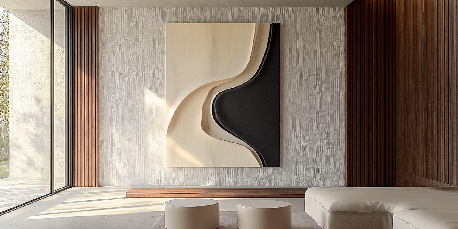
5. Showcasing Art: Choosing the Right Paint Colors
Selecting the appropriate wall color is crucial for highlighting artwork. Neutral backgrounds can make vibrant pieces pop, while complementary colors can create harmony.
Discover tips on enhancing your art collection through strategic paint choices in our guide on the best paint colors in home to showcase art.
The key is contrast. Dark art on light walls and light art on dark walls always makes a statement. Pay attention to undertones: cool-toned art pairs well with crisp whites and greys, while warm-toned art shines against creams and taupes.
Also consider your frames. Black, gold, or natural wood can either add formality or casualness to your art display. Choosing wall colors that enhance the frame as well as the artwork itself gives a gallery-like effect.
6. Kitchen Colors: Infusing Energy into the Heart of the Home
Kitchens are embracing color in 2025, moving beyond traditional whites and greys. Warm hues like cinnamon, olive green, and even soft pinks are being used to create inviting and lively spaces.
For inspiration on updating your kitchen's palette, explore our article on best kitchen paint colors.
Colored cabinetry is a trend that’s here to stay. Navy blue, forest green, and warm mushroom tones are becoming the new staples. Pair with brass or matte black fixtures for a modern finish.
Another technique is color zoning—using different tones for upper and lower cabinets or setting off an island in a contrasting hue. This adds interest without overwhelming the space.
7. The New Neutrals: Soft, Bold, and Timeless
The concept of neutrals is expanding to include colors that, while subtle, carry more personality. Think of shades like muted lavender, soft peach, and gentle mustard. These "new neutrals" offer the versatility of traditional neutrals with added warmth and interest.
Learn more about incorporating these hues into your home in our feature on the new neutrals for 2025.
These tones work wonderfully in nurseries, home libraries, and transitional spaces like hallways. Because they're more distinctive than traditional neutrals, they bring charm and individuality without becoming overbearing.
Layering these new neutrals together can create unexpected harmony. Try combining soft clay pink with misty blue for a soothing, almost coastal vibe that feels fresh yet grounded.
8. Personalizing Your Space with Custom Wall Art
Color trends provide a framework, but personal expression is key to creating a space that truly feels like home. Custom wall art allows you to infuse your personality into your decor, choosing pieces that reflect your unique style and preferences.
Explore our range of custom wall art to find the perfect pieces that resonate with you and complement your chosen color palette.
Artwork not only tells a story but enhances your emotional connection to a space. Whether it's an abstract in bold tones or a minimalistic piece in monochrome, what you choose matters.
Don’t forget scale: large wall art can serve as a focal point, while a gallery of smaller pieces can create an intimate visual rhythm. Choose frames and placements that align with your room’s architectural features.
In 2025, color is a powerful tool in interior design, capable of transforming spaces and influencing emotions. By understanding and embracing current trends, you can create a home environment that is both stylish and reflective of your personal narrative.
Let color tell your story. Let your space speak your soul.


