The right wall art can inject vitality into home decor and showcase your unique taste. Whether you purchase exquisite wall art decorations or create your own DIY wall art pieces, they are all worth displaying in your home gallery. However, before hanging wall art on the wall, be sure to consider the background, wall, and paint color.
The color of the wall is just as important as the frame of the artwork. It should not steal the spotlight from the wall art, but rather complement it. You put a lot of effort into selecting and arranging your wall art. So you should give the same amount of attention to choosing the color of your interior walls.
So, how do you determine the best paint color for displaying art in your home? Read on to learn how to choose the best wall color for your artwork.
1. Consider Personal Preferences
Before hanging any artwork on your interior walls, consider the direction and concept of your decor. Imagine what you want your interior space to look like when everything is in place.
If you want to create a calm or comfortable atmosphere, or if you want the space to be more elegant, bright, or clean. Your choices will help you determine the best color scheme to complement your artwork and wall colors.
Darker and cooler tones are ideal for creating a peaceful atmosphere, such as green, blue, and purple. For a brighter, more minimalist design, consider combining neutral colors with soft, light tones. If you want to add drama to your interior decor, opt for bright, warm colors like magenta or red.
2. Identify the Base Color of the Wall Paint
You may think the color of your interior walls is obvious, but take a closer look. Unless the walls are completely white, there is almost certainly some underlying color. It is important to note that these underlying colors will influence the overall tone. Gray, beige, and white are all paint colors with underlying tones. The challenge is that these “hidden” colors are difficult to detect until they are contrasted with other tones.
This is why color swatches are so useful. If your interior wall color is eggshell white, cream, ivory, or a similar neutral white. Then you should use the purest white on the swatch to identify the base color. Similarly, compare the wall with different shades of blue, beige, or gray to sense the subtle base colors influencing the main tone.
Therefore, you need to match the color scheme of the artwork with the base color of the walls. This will ensure that all elements look harmonious when placed together. To better understand how the quality of prints affects overall wall aesthetics, check out our guide: Recognize High-Quality Prints.
3. Choose a Color Scheme
Here are some important design concepts and when to use the color wheel. Generally, you have three color schemes to choose from: monochromatic, complementary, or analogous. Let's take a look at what each scheme means.
3.1 Monochromatic
This is a monochromatic color scheme. Monochromatic design creates a harmonious and unified visual effect by using different shades of a single color. Based on the wall color, select several different shades, tones, or brightness levels of the color and incorporate them into the artwork.
3.2 Complementary Colors
If you want to create a stronger visual impact with wall art, consider a complementary color scheme. On the color wheel, complementary colors are located opposite each other, such as green and purple, or orange and blue. Combining complementary hues creates a strong contrast, adding interest to the space.
If the wall paint color is neutral, consider the base color when choosing complementary colors. If the wall already has a specific color, find its opposite color on the color wheel.
For ideas on how color impacts mood in specific spaces, read our blog: Which Colors of Abstract Paintings Are Suitable for Bedrooms.
3.3 Similar Colors
Similar colors are colors adjacent to each other on the color wheel. Using different shades of the same color can create a more peaceful and harmonious effect between the hanging artwork and the wall color.
First, select a main color, then choose two or three others as accent colors. If the wall paint color is neutral, start the color scheme from the base color of the wall. For example, if the wall color has a light blue undertone, you can choose soft green and navy blue as accent colors.
To explore color pairings in shared spaces, check out Which Colors of Abstract Paintings Are Suitable for the Living Room.
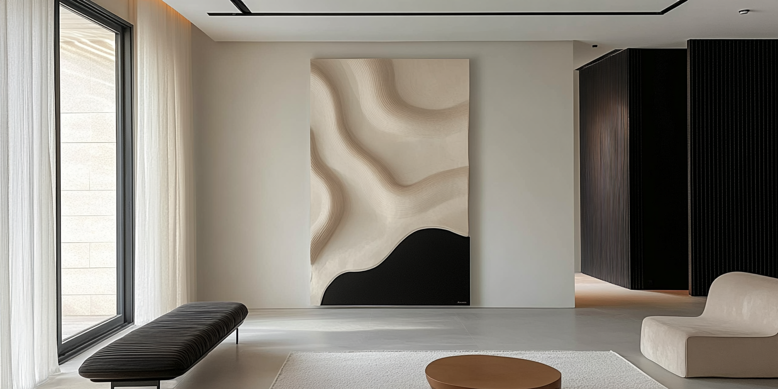
4. The Best Wall Paint Colors for Hanging Artwork
4.1 Neutral Colors
Neutral-toned walls are always an ideal choice for displaying artwork. For a dramatic atmosphere, opt for darker shades such as deep blue-gray.
4.2 Sky Blue
Sky blue walls create a striking contrast with artwork dominated by white. Both the artwork and the wall color have a flowing texture, infusing the space with a peaceful and dreamy ambiance.
4.3 Olive Green
Olive green walls complement traditional artwork and furniture in retro-style interior design. This shade evokes the atmosphere of the 1960s and 1970s.
4.4 Lavender Blue
To maintain a consistent overall style, choose a wall paint color that covers the picture frame. For example, soft lavender blue walls paired with silver picture frames highlight each color block.
4.5 Peach Orange
If the wall art is vibrant, avoid choosing the same color tone for the walls. Soft, low-saturation paint colors highlight the artwork while toning down other areas. Vibrant coral or peach orange backgrounds complement understated artwork. You can use contrasting tones to add balance and interest to the space.
4.6 Yellow
Yellow can echo the white accents in the space. In a predominantly white environment, bright yellow wall paint can highlight artwork and furniture without overwhelming the space.
4.7 Terracotta
Black and white photographs stand out against dark walls. For example, terracotta walls pair well with gray or black and white artwork.
Explore art by style to perfectly pair with these colors:
-
Minimalist Wall Art for a clean, modern vibe
-
Contemporary Wall Art for bold and refined touches
-
Boho Wall Art for a relaxed, artistic feel
5. Conclusion
Before starting interior painting work, consider the colors, sizes, and types of artwork you plan to place on the walls. If you are still unsure about which color to choose, refer to the above suggestions and color swatches.
If you are still having difficulty determining the best wall paint color to complement your artwork, consult the most professional painting contractor in your area. This will ensure you receive expert guidance and achieve the best results for your project.


