Choosing the perfect hues for your living room’s modern abstract wall art involves more than matching your sofa—colors profoundly affect mood, perception of space, and the overall vibe of your home. In 2025, designers favor a spectrum from soothing blues and greens to earthy browns and muddy pinks, blending contemporary trends with timeless psychology. Understanding these effects helps you select pieces that not only look beautiful but also foster the desired atmosphere—whether that’s calm relaxation or vibrant energy.
1. Calming Cool Tones: Blues & Greens
Shades of blue and green are renowned for their tranquil, restorative qualities, making them ideal for social spaces like living rooms. Soft blues can make a room feel more open and airy, while quieter greens—such as sage or hunter—evoke nature and balance. For more serene options, browse our abstract wall art collection to find pieces that bring the outdoors in.
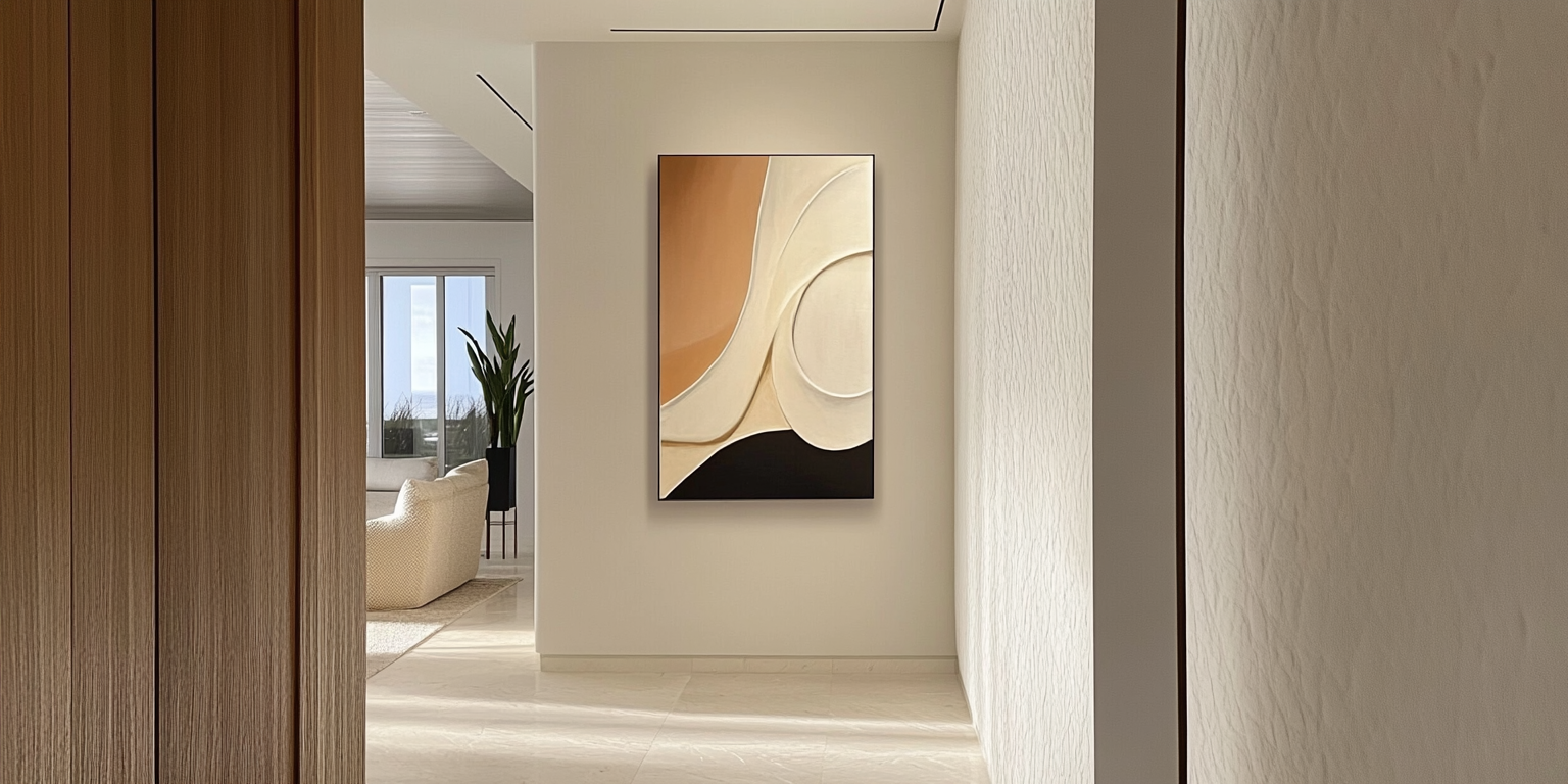
2. Warm Earthy Hues: Browns, Terracotta & Yellows
Warm earth tones like terracotta and rich browns create a cozy, grounded ambiance that’s perfect for unwinding after a long day. In 2025, “Truffle Brown” and dusty reds are topping trend lists for their ability to pair seamlessly with neutrals or serve as a dramatic focal point. If you prefer gentle curves and organic shapes, explore our curved wall art for earth-toned abstracts that feel both modern and inviting.
3. Muted Muddied Pinks & Purples
Complex, “muddied” pinks and purples—think dusty mauve or eggplant—offer a refined twist on traditionally bold hues, adding depth without overpowering a space. These tones work especially well in living rooms seeking a touch of luxury and warmth, evoking both creativity and comfort. Find timeless palettes in our vintage wall art selection to incorporate these sophisticated shades.
4. Vibrant Accents: Chartreuse & Bold Contrasts
For those who love a pop of energy, chartreuse and other vibrant accents can act as modern neutrals when used sparingly—perfect for pillows, throws, or a single statement painting. Pair chartreuse highlights with complementary metallics or deep charcoals to achieve dynamic contrast without chaos. Dive into our blog post Interpret the Meaning of Abstract Art to see how strategic accent colors transform mood and perception.
5. Neutral Foundations: Greige & Off-Whites
Neutral “greige” (gray-beige) and soft off-whites provide a versatile backdrop that allows your abstract pieces to shine while maintaining a cohesive environment. These understated hues give you freedom to rotate accent works in different colors—such as bold reds or blues—without repainting walls. Check out The most popular abstract art paintings in 2025 for inspiration on pairing neutrals with trending color palettes.
6. Styling Abstract Colors in Your Living Room
When styling, aim for balance: one large statement piece in a vibrant hue can be offset by subtler companions in similar tones or complementary shades. Grouping works—such as a triptych of blues and greens—can create a gallery-wall effect that feels curated yet harmonious. See stunning ideas in Contemporary Wall Art for Living Room to learn how professionals mix and match abstract colors.
7. Seasonal Rotation for Ever-Fresh Interiors
Rotating abstract works with the seasons keeps your space feeling current and engaging.
Spring calls for light florals and pastel washes, summer for bright, energetic contrasts, autumn for warm terracotta and ochre tones, and winter for deep jewel-tones or serene cool fields.
By swapping just one or two pieces every quarter, you align your décor with nature’s cycle and stave off visual fatigue.
8. Virtual & Augmented Reality Previews
Before committing to large-scale abstracts, use AR apps to virtually “hang” art in your actual room, ensuring perfect scale and color harmony.
Platforms like Minted’s wall art visualizer let you point your phone at any wall and instantly test different pieces and sizes in real time.
Some retailers now offer full VR gallery tours so you can experience immersive exhibitions at life-size scale without leaving home.
9. Art Investment & Market Value
Abstract art has grown into a stable alternative asset, with private sales up 17% year-over-year despite auction dips, making mid-career artists a compelling hedge against market volatility.
Collectors eye emerging painters featured in Artsy’s 2025 trend reports for potential 5–10 year appreciation, focusing on provenance, edition size, and exhibition history to maximize ROI.
10. Sustainable & Eco-Friendly Practices
Eco-conscious buyers now seek art made with recycled canvases, organic pigments, and carbon-neutral framing.
Initiatives like “Art for Your Oceans” showcase works in seaweed ink harvested from farmed kelp—merging environmental narrative with rich, earthy texture.
Opt for FSC-certified wood frames or reclaimed materials to reduce your décor’s carbon footprint without compromising style.
11. Custom Commissions & Personalization
Commissioning bespoke abstracts ensures perfect scale, palette, and emotional resonance in your living room.
Start with a clear brief—desired mood, color avoidances, wall dimensions—and allow the artist to innovate within their signature style.
Platforms like Abstract House streamline the process, delivering site-specific originals complete with certificates of authenticity in as little as 2–3 weeks.
12. The Art of Layering Textures & Patterns
Layering diverse textures—impasto paint, metal leaf, textile seams—adds depth and tactility to abstract groupings.
Combine a smooth color-field canvas with a heavily textured mixed-media piece to create contrast and intrigue.
Introduce patterned pillows or rugs that echo abstract motifs to tie the room together and reinforce your color story.
13. Smart Lighting & Home Automation
Smart lighting systems can shift color temperature and intensity throughout the day, enhancing mood and highlighting abstract details.
Use focused track lights or picture-lights with adjustable beams for sculptural abstracts; LED backlighting can dramatize mixed-media reliefs.
Integrate with home-automation hubs to schedule warmer tones in the evening and cooler daylight hues by day, optimizing comfort and energy use.
14. Cultural Context & Personal Expression
Abstract art often channels cultural narratives—from Russian avant-garde echoes to contemporary AI-driven motifs—infusing your living room with story and meaning.
Selecting works by diverse global artists broadens aesthetic dialogue and embeds personal identity within your décor.
Pairing culturally resonant pieces with complementary accents (textiles, artifacts) fosters a layered, authentic environment.
15. Care & Maintenance Best Practices
Maintain stable humidity (45–55%) and avoid direct UV exposure to preserve pigment vibrancy over time.
Dust gently with a dry microfiber cloth; never use water or solvents on acrylic and mixed-media surfaces.
For framed works, consider UV-filtering glazing to shield against fading in bright rooms.
16. Conclusion & Next Steps
Selecting colors for abstract paintings in your living room is a blend of psychology, trends, and personal preference. Whether you lean toward calming cools or warm earth tones, thoughtful color choice ensures your space feels both stylish and attuned to your mood. Need help refining your pick? Read choose the perfect wall art for living room for a step-by-step guide tailored to your décor.


