Paint colors may completely transform a room. But not all popular colors last. Some paint color trends are superficial and fleeting. Instead, designers choose paint colors that are carefully selected for their practicality, mood, and versatility.
This year, we've seen paint color trends shift from being merely visually appealing to being pleasing, rich, and versatile. In addition, designers are no longer choosing paint colors based on what will look good in the showroom, but instead are selecting shades that enhance the feel of the home. For example, soft neutral tones bring warmth, and vibrant hues add character. And deeper shades bring an intimate, high-end feel.
This post will feature paint colors used in real homes, not just those that look good on Instagram. Let's take a look at the popular paint colors of 2025 and how you can incorporate them into your environment.
1. Earth Tones: The Backbone of Modern Spaces
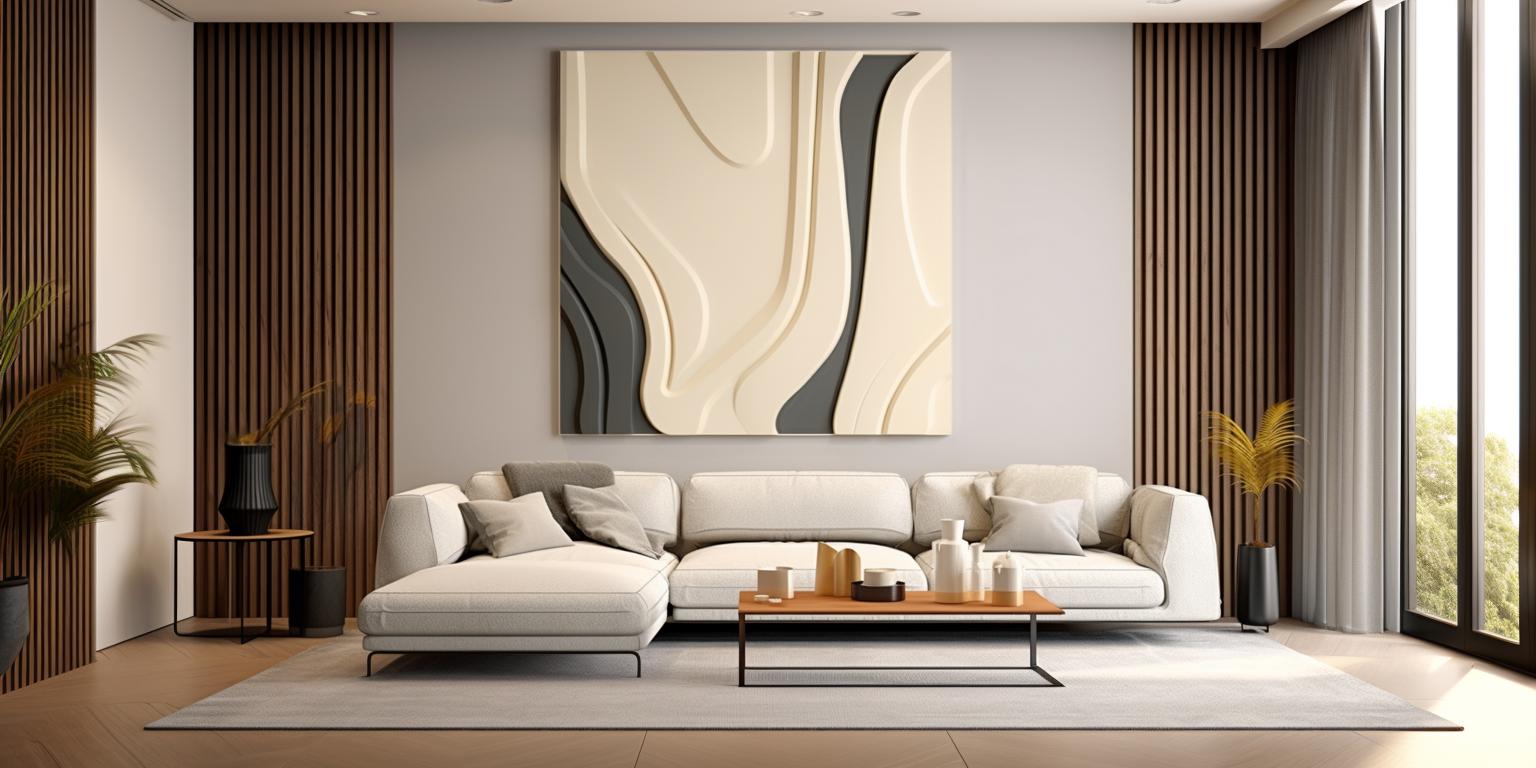
Neutrals have always been a go-to for designers. But in 2025, earthy neutrals will replace the cool grays and crisp whites that dominated the previous decade. These darker, warmer neutrals add an inviting dimension to a room. They can feel cozy and sophisticated rather than boring and simple.
Earthy neutrals are versatile and can be used in any room. Whether it's painting an entire living room, an entryway, or a bedroom. These colors provide a timeless and clean backdrop. Taupe, gray, and warm beige give a soft, organic, and character-filled feel. In addition, they can be contrasted with cool neutrals, like those found in cool colors wall art.
1.1 How to Use
To bring out the warmth of these colors, you can line your room with natural textures such as linens, jute rugs, and wooden furniture. Also, if your room has plenty of natural light, earthy neutrals will appear slightly lighter and give off a lovely soft glow throughout the day.
To avoid looking monotonous, pair them with contrasting rich tones—such as navy, charcoal, or forest green. These neutrals pair beautifully with black or dark bronze fixtures. This pairing has contrast and depth without looking loud. For inspiration, check out oil painting that complement neutral tones beautifully.
2. Melancholy Blues and Dark Greens: Personalized Walls and More
If you want to get away from neutrals but also want your room to feel timeless and elegant, then deep blue and dark green are the colors for you. These colors add layers, drama, and comfort without overpowering the room.
Dark blue and dark green tones are especially effective in dining rooms, offices, and built-in bookshelves. They give a polished and elegant look. If you want to add character to a room but don't want it to feel too dark, you can try using these shades on accent walls, cabinets, and even the ceiling.
2.1 How to Use
For a balanced look, dark walls can be paired with light-colored furniture, warm wood tones, and metal accessories. In addition, in well-lit rooms, natural or artificial light will make these shades appear richer.
If you're afraid to take the plunge, start with a navy or dark green bathroom, island, or bookshelf before painting the entire space. Want to take this trend to the next level? Pair dark blues and greens with brass hardware and warm walnut. They can create a luxurious, high-end look. You can explore more warm colors wall art to complement this palette.

3. Soft Pinks and Sunset Tones: A New Take on Warm Colors
Soft pastels and sunset shades are becoming increasingly popular with people looking for softer, more organic tones. These shades add warmth, glamour, and a touch of romance without being overly feminine or trendy.
The trick to making these shades work is to pair them with neutral elements. Soft pinks, russets, and subtle peach colors are ideal for bedrooms, bathrooms, and even kitchens. They add warmth without taking over the whole space. For example, colors of abstract paintings are suitable for bedrooms offers excellent pairing ideas.
3.1 How to Use
To make it work, you should use crisp white accents to keep the hue fresh. It is important to note that you should avoid using colors that are too warm. Additionally, you can use wood and brass finishes to balance softness and darkness.
If you feel that coloring the entire room is too bold, then you can try using these colors on trim, doors, or accent walls. You can contrast soft pastel colors with olive green or dark charcoal. This will create a modern and timeless look. For further color pairing tips, check out best kitchen paint colors.
4. Unexpected Dark Colors: Bold and Effective Choices
Darker shades not only bring drama to a room, they also elevate it and make it more sophisticated. In 2025, dark charcoal, espresso brown, and near-black shades are trending. This suggests that with the right treatment, darker tones may be comforting rather than intimidating.
4.1 How to Use
You use dark colors for walls, built-ins, and ceilings to create contrast. To make the space feel more welcoming, pair it with light-colored flooring, warm woods, and soft textiles. You can also add gold or brass colored lighting accessories for a more opulent look.
If dark colors make the room feel too intense, then you can also try using these colors on fireplace mantels, doors, or cabinets. This adds drama without making the space seem overwhelming. Interested in more ideas? Check out colors of abstract paintings are suitable for living room.
5. Playful Pink: Modern Colors
Pastels are no longer reserved for nurseries. 2025 is the year that designers start using understated and sophisticated colors like light blue, lavender, and sage. They can add a fresh and sophisticated appeal to a home.
Pastel colors are great in kitchens, creative studios, and reading areas. These paint colors can give a light, serene feel. Unlike regular pastels, these colors have earthy undertones that make them feel polished and not sweet.
5.1 How to Use
You can pair pastels with warm woods, black accents, or crisp white. This will give your room a more modern effect. Also, you can use them to add a subtle splash of color to kitchen cabinets, built-ins, and furniture.
On the other hand, textured fabrics like linen or burlap may help keep the space airy. You can also combine pink cabinets with matte black hardware and minimalist decor for a modern look. For more ideas on coordinating color and art, explore the best paint colors to showcase art.
6. To Summarize
As society evolves, popular paint colors are not fixed. In this article, we have presented the popular colors that designers have endorsed for the year 2025. These paint colors can help you create intentional and livable spaces that are both appealing and timeless.
Whether you prefer warm neutrals, intense blues, soft pastels, or exaggeratedly dark colors, the goal is always to choose a color that expresses your personality and complements the environment of your house.
Explore more curated decor ideas and color-coordinated artwork on 3d wood wall decor.


